



Unique piece – only one available.
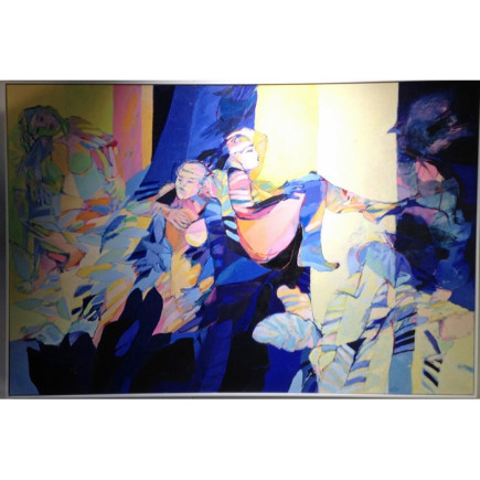
An original painting by Willebrord de Winter, created in oil on canvas and measuring an impressive 120 cm high × 180 cm wide.
A dynamic composition in which human forms, movement, colour and light come together.
 Secure payment with iDEAL | Wero, bank transfer or ICS
In Studie Dejauner A, several human figures and forms are interwoven. Some figures are clearly recognisable, while others almost merge into the surrounding areas of colour. This creates a layered composition in which new lines, postures and details emerge the longer you look. Deep shades of blue form a powerful contrast with bright yellow areas, soft skin tones, muted green and warm pink accents. The dark sections add depth to the painting, while the lighter areas open up the composition and introduce a sense of movement. Loose lines, visible brushstrokes and overlapping areas of colour give the work a spontaneous and expressive appearance. At the same time, the balance between light and dark and the rhythm of the figures bring cohesion to the composition. As a result, the painting can be experienced as both powerful and contemplative. With its generous horizontal format of 120 × 180 cm, the painting has a strong presence in a room. It is best displayed on a spacious wall, with enough viewing distance to appreciate the entire composition.
Willebrord de Winter was born in Rotterdam in 1941 and studied at the Gerrit Rietveld Academie. The human figure is an important starting point in his work. Working from observations and drawings, he builds compositions in which figures, areas of colour and movement are connected. His direct approach to painting and free use of colour give his work a recognisable and lively appearance in which the artist’s individual hand remains visible.
Studie Dejauner A combines strong, expressive colours with quieter, lighter areas. This allows the painting to take on different roles within an interior. Against a warm wall, the yellow and pink tones become more prominent. A soft pink background makes the composition feel gentler, while a deep blue wall adds depth and creates a luxurious atmosphere. Because the artwork already contains plenty of colour, movement and detail, there is no need to repeat every colour from the painting throughout the room. Choose one main colour and one supporting colour. Keep the remaining materials calm, allowing the painting to remain the primary focal point.
Decoration colours: Goethe Yellow and Mystery Grey
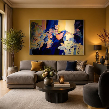
A wall painted in Goethe Yellow highlights the warm yellow areas of light within the painting. It brings energy and warmth into the room, while allowing the deep blue tones in the artwork to remain clearly visible. Mystery Grey can be used on a sofa, cabinet, armchair or another large interior element. This calm grey shade creates balance and prevents the overall composition from becoming too exuberant. Dark blue accessories can strengthen the connection with the painting, but should be used sparingly. This scenario is suitable for a living room that may feel warm, personal and expressive.
Decoration colours: Shabby Pink and St. Helena Blue
Shabby Pink gives the room a soft, warm foundation and connects with the pink and skin-toned areas in the composition. The colour softens the painting’s powerful appearance without taking away its energy. Dining chairs in St. Helena Blue, perhaps upholstered in velvet, bring out the deep blue tones in the painting. A wooden table and reused or vintage furniture add warmth and provide a natural counterbalance. This scenario creates an inviting dining room in which art, colour and togetherness take centre stage.
Decoration colours: St. Helena Blue, Gold and Montmartre Grey
A wall in St. Helena Blue allows the light and yellow areas of the painting to stand out powerfully. The dark background brings tranquillity and depth to the bedroom while enhancing the artwork’s luxurious appearance. Gold can be introduced subtly through lighting, frames, furniture fittings or small accessories. Montmartre Grey provides a calm countercolour for bed linen, a rug or upholstered furniture. Combining glossy accents with matt fabrics creates a layered hotel-chic interior. This scenario suits a bedroom that may feel embracing, stylish and luxurious, with the painting as a powerful focal point above the bed or on another spacious wall.
The interior images accompanying this artwork are atmospheric impressions created with the help of the Decoration Color Visualizer. Decoration Paint colours were used as the starting point to demonstrate how the artwork can interact with colour, materials, light and space.
The artwork is located at Pot Interieur in Axel and can be viewed there in person during opening hours. This allows you to experience the actual colours, brushstrokes, texture and dimensions. Following purchase, the painting may be collected immediately by arrangement. Artworks are not normally shipped as standard parcels. Depending on the size, material and value, we arrange either a personal handover or specialised art transport. After a reservation or purchase, we will contact you to coordinate the transport and handover carefully.
1. Is ‘Studie Dejauner A’ a unique artwork?
Yes. It is an original painting by Willebrord de Winter and, as a unique piece, is available only once.
2. What material is the painting made from?
The artwork is created in oil paint on canvas.
3. Can I view the painting before purchasing it?
Yes. The artwork can be viewed in person at Pot Interieur in Axel during opening hours. This allows you to experience its actual colours, texture and appearance.
4. Where can I display a painting measuring 120 × 180 cm?
Due to its generous horizontal format, the painting requires a spacious wall. It could be placed above a wide sofa, low cabinet, dining table or bed. Leave sufficient open space around the artwork so that the composition is not enclosed by tall furniture or too many small accessories.
5. How will this large artwork be transported?
The painting is not normally shipped as a standard parcel. After reservation or purchase, we will discuss which form of personal handover or specialised art transport is most suitable.
Specific References
No customer reviews for the moment.
Unique piece – only one available.
An original painting by Willebrord de Winter, created in oil on canvas and measuring an impressive 120 cm high × 180 cm wide.
A dynamic composition in which human forms, movement, colour and light come together.