









INSPIRATION

Mid-century Modern

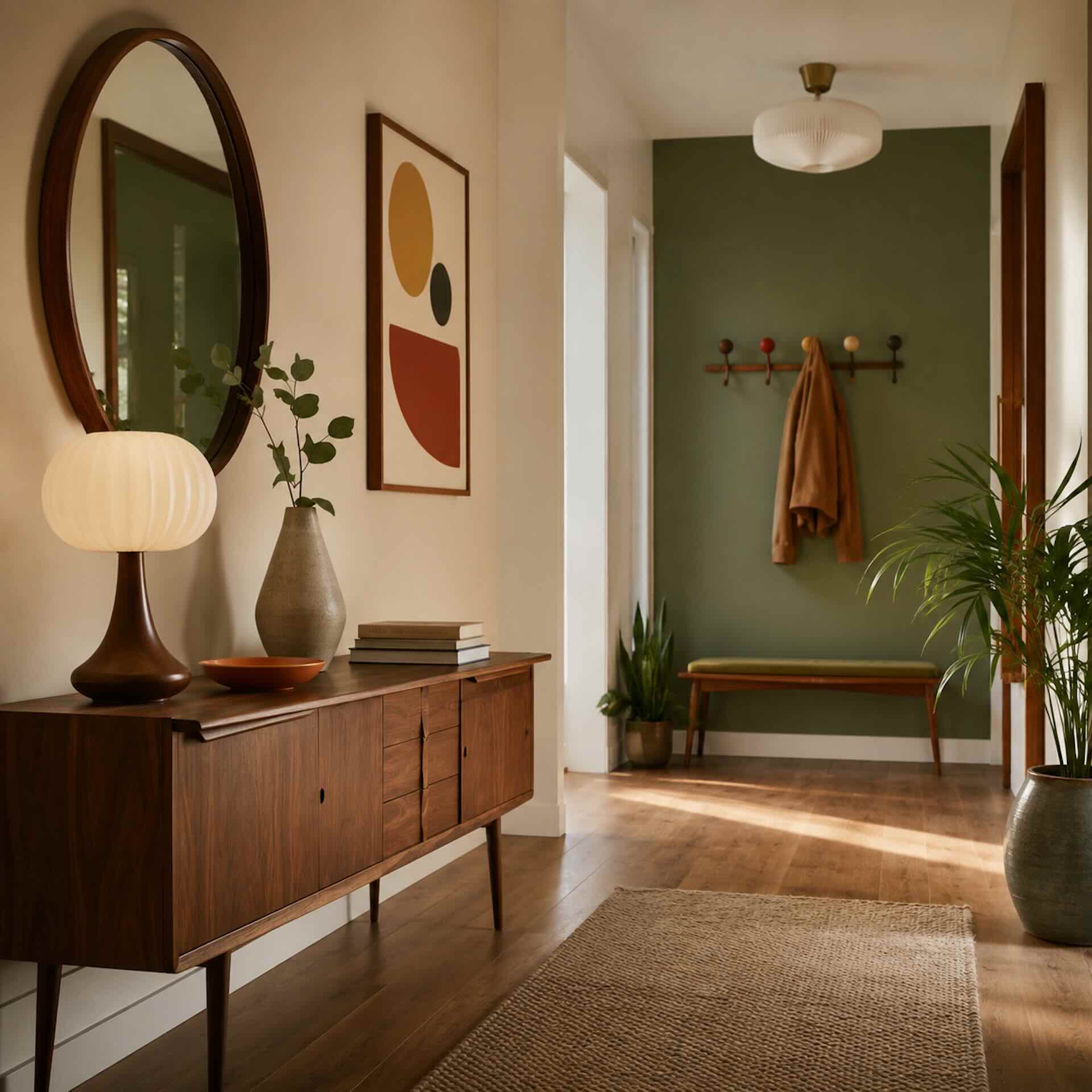
Mid-century Modern originated in the 1950s and 1960s, a period when interior design was strongly influenced by architecture, functionality and the desire to create simpler, lighter living spaces. Furniture became lower, lines became cleaner and shapes took on a softer, more organic appearance. Everything served a purpose, while still being allowed to feel beautiful and refined.

COLOURS

Mid-Century Modern colour palettes

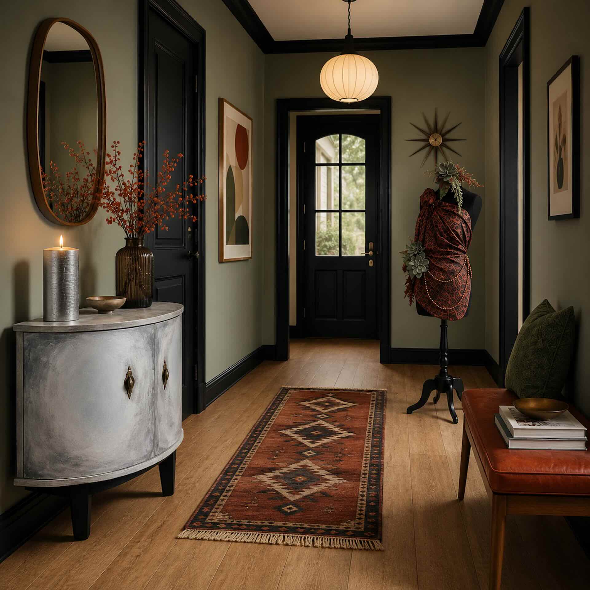
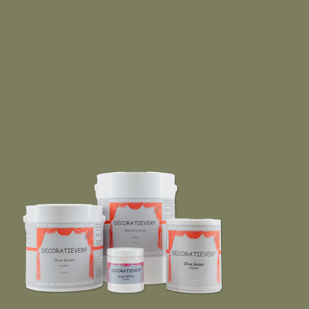
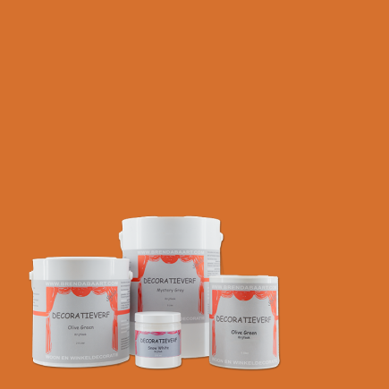
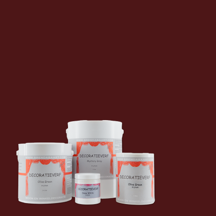
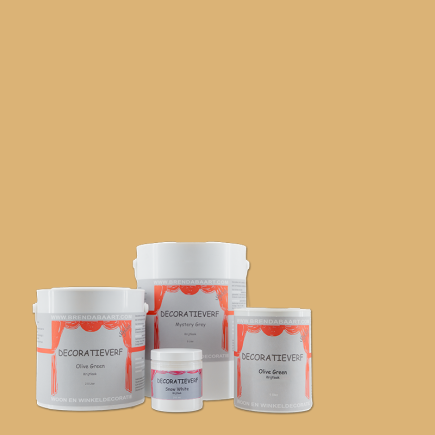
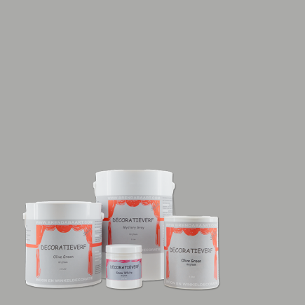
With Decoration Paint, you can give this classic style a contemporary interpretation. Georgian Green adds depth and creates a connection with nature, Namibian Sand brings warmth, Carmine Red provides a bold retro accent, and Casper Blue adds freshness and an airy feel. Goethe Yellow, Montmartre Grey, Venetian Green and Cornwall Black are the complementary colours that complete the palette.

PALETTE 1

Warm & Graphic

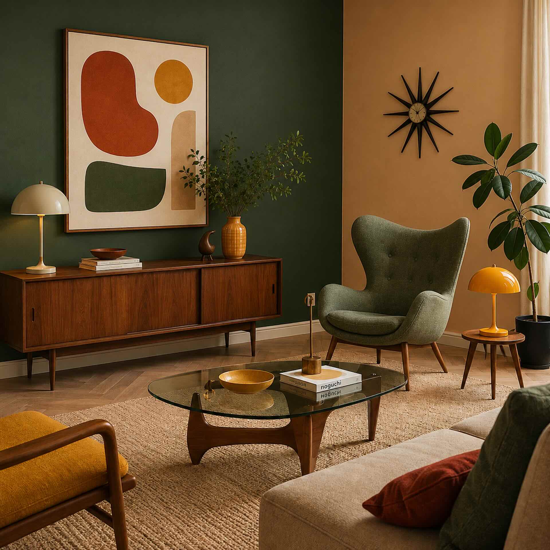
Georgian Green – Namibian Sand – Carmine Red – Goethe Yellow

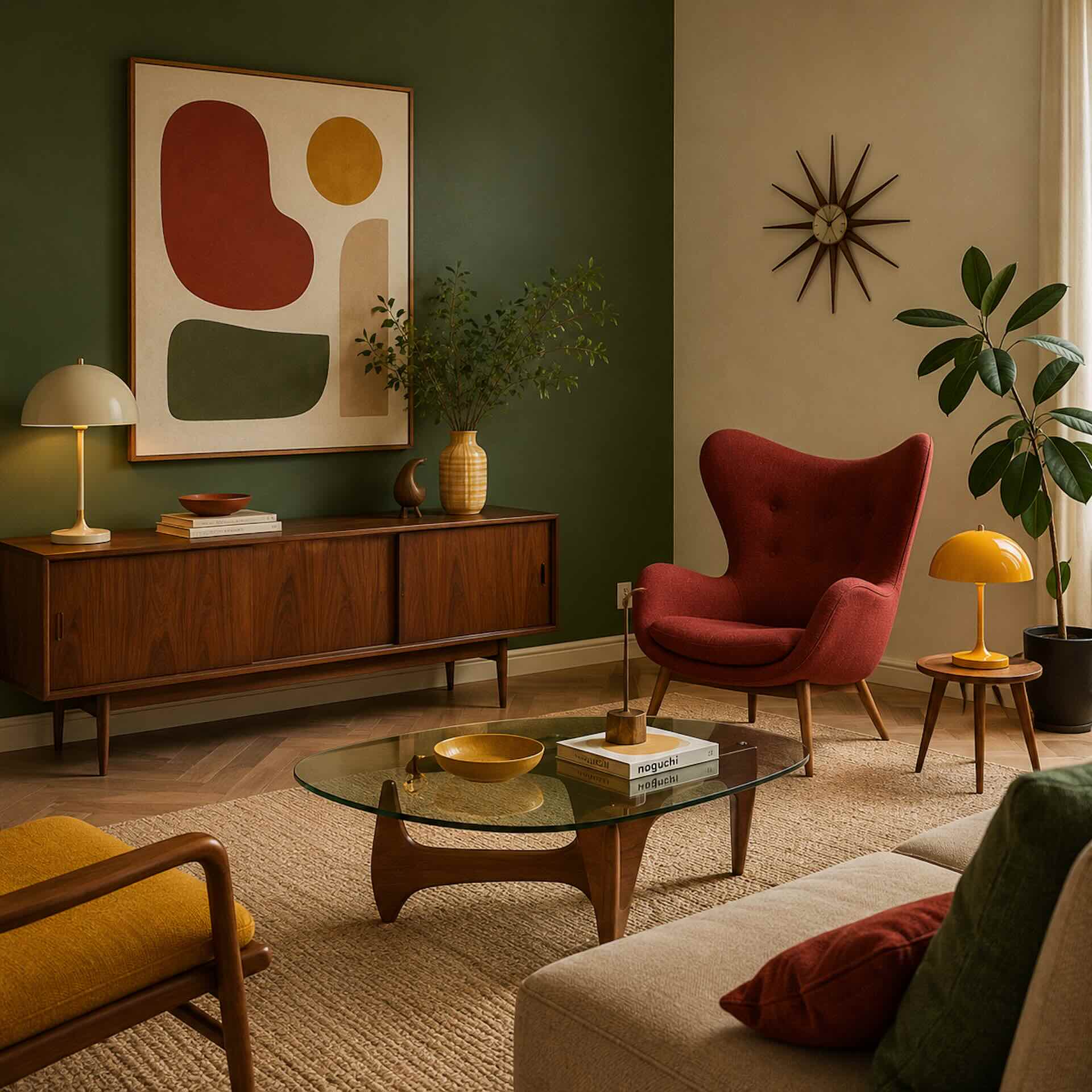
Georgian Green creates a strong, natural foundation, while Namibian Sand adds warmth and calm. Carmine Red brings energy as an accent in artwork, furniture or textiles. Use Goethe Yellow sparingly and deliberately, for example in accessories or a graphic detail. This palette pairs beautifully with walnut, teak, rounded shapes, warm-toned art and wood-effect flooring. Keep the red and yellow accents balanced, so the interior feels bold without becoming visually overwhelming.

PALETTE 2

Cool & Modern

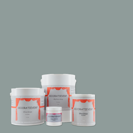
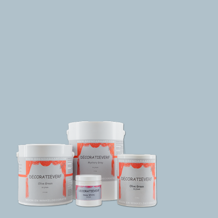
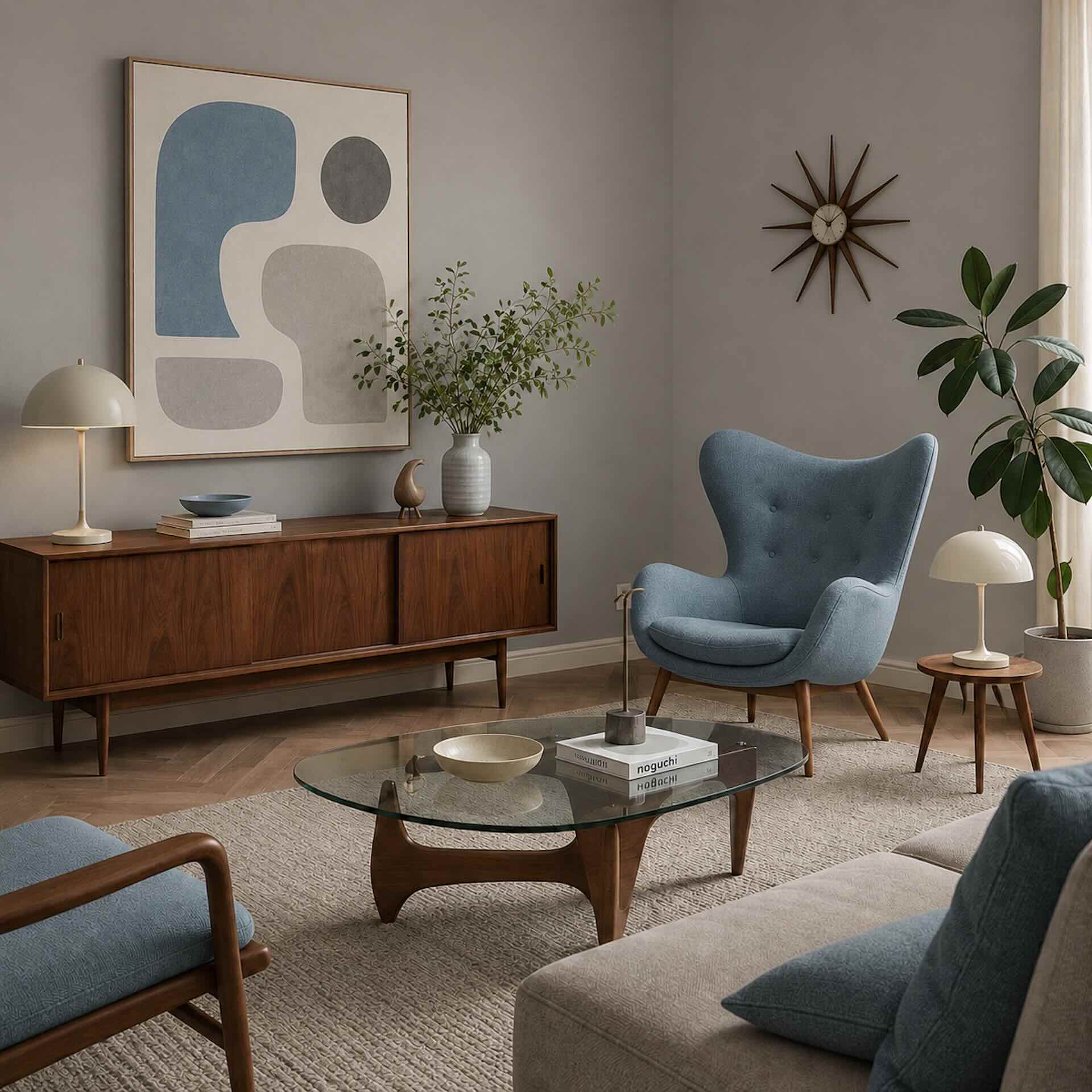
Casper Blue – Montmartre Grey - Snow White - Peyote Green

A calm, minimalist combination with a fresh Mid-Century feel. Montmartre Grey and Snow White create a solid foundation, while Casper Blue and Peyote Green add softness and lightness through textiles, curtains or a statement piece of furniture. This palette works beautifully with slender furniture legs, graphic art, subtle wood grains and plenty of natural light. In a north-facing room, Casper Blue may appear cooler; balance it with warm wood, leather-look materials, Namibian Sand or soft Decoration fabrics.

PALETTE 3

Deep & Contrasting

Venetian Green – Cornwall Black – Goethe Yellow - Namibian Sand

Venetian Green brings rich depth and an elegant, natural atmosphere. Cornwall Black adds clean lines and graphic contrast, while Namibian Sand together with Goethe Yellow softens the overall look and brings warmth. This palette works beautifully in spaces with plenty of natural light and strong design pieces, such as a low sofa, a sculptural lamp, wood and graphic art. In small or darker rooms, use Cornwall Black mainly as an accent so the interior does not become too heavy.

HOME ACCESSORIES

Mid-Century accents that create connection

Home accessories add personality and completeness to a Mid-Century Modern interior. Choose accessories with a distinctive shape, a warm appearance and a clear function within the overall design. Think of cushions, candles, vases, placemats, art objects or a restored vintage piece of furniture painted in one of the Decoration colours. Work with a few strong accents rather than many separate decorative items. Carmine Red, Goethe Yellow or Namibian Sand can return beautifully in smaller accessories, while Georgian Green, Venetian Green or Casper Blue create a visual connection with furniture, curtains or the wall colour. The strongest result is achieved when accessories are not added at random, but repeat colours from the palette. This gives the interior rhythm, calm and that recognisable Mid-Century balance between form, function and atmosphere.

Ramanda’s tip

“Mid-Century Modern is all about form, calm and clean lines. Modern technology is indispensable, but it does not always need to be visible. Create clever storage solutions for the television, audio equipment, chargers, cameras and other devices. Choose, for example, a low sideboard, vintage cabinet or sleek piece of furniture on slender legs. This allows you to enjoy modern comfort while keeping the interior calm, timeless and true to the atmosphere of the 1950s and 1960s.”
MATERIALS * TEXTURES * LIGHT

Bring Mid-Century Modern into your home

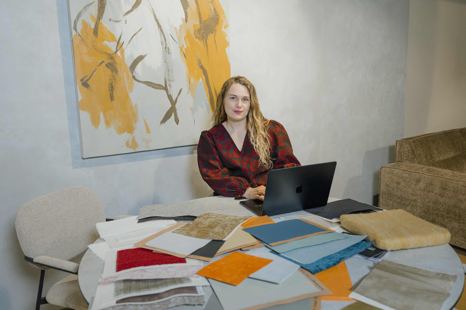
In Mid-Century Modern interiors, everything revolves around the combination of materials, textures and light. Warm wood grains, leather-look materials, matte paint, soft fabrics and graphic shapes together create that recognisable 1950s and 1960s look: clean, functional and still warm.

Use Decoration Paint with a matte chalky finish on walls, furniture or accessories, and repeat colours in curtains, cushions, tablecloths or placemats. In this way, a vintage cabinet in Georgian Green, Venetian Green or Namibian Sand is instantly given a second life.

Light determines how much colour a room can carry. In spaces with plenty of daylight, Venetian Green, Carmine Red or Cornwall Black can take on a stronger presence. In rooms with less natural light, Casper Blue, Montmartre Grey or Namibian Sand keep the whole look lighter and more liveable.

The most beautiful result comes from contrast: smooth next to matte, wood next to textile, graphic next to organic.

SHOP HERE

MID-CENTURY MODERN AT DECORATION

Mid-Century Modern is not about using lots of decoration, but about strong shapes, warm materials and an interior that feels both calm and full of character. With wood, graphic lines, matte colours and carefully selected accents, you can turn any room into a timeless and inviting space.

Discover which colours, fabrics, furniture and home accessories suit your Mid-Century interior, and create your own balance between form, function and warmth step by step.