Mid-Century Modern – Timeless Design and Confident Simplicity
Discover the Mid-Century Modern Style: Form, Function and Colour in Balance
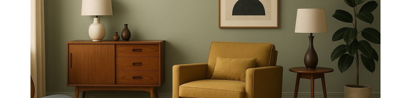
The Mid-Century Modern style originated in the 1950s and 60s and is defined by clean lines, organic shapes and functional design. Furniture stands on slender legs, materials are honest and colour is used intentionally as a strong accent. The result is an interior that feels open, airy and architecturally balanced.
With colours from the Decoration collection such as Georgian Green, Namibian Sand, Carmine Red, Casper Blue and Montmartre Grey, you create a harmonious foundation that allows design to stand out. Combine colour blocking with warm wood, leather and subtle metal details for a space that feels modern yet inviting.
Characteristics of the Mid-Century Modern Style
Clean Lines & Organic Shapes
Minimalist silhouettes combined with rounded, flowing details.
Functional Design
Furniture is practical, lightweight and thoughtfully designed.
Warm Woods
Walnut, teak and fine veneers define the character.
Graphic Colour Blocking
Colour is deliberately applied to walls or furniture.
Light & Openness
Spaces feel structured yet airy.
Tips for a Mid-Century Modern Interior
Use one strong accent wall in a confident colour.
Combine warm wood tones with a calm base such as Namibian Sand or Montmartre Grey.
Introduce geometric patterns subtly in textiles or artwork.
Choose furniture with slender legs to maintain visual lightness.
Limit accessories and let shape and material speak.
A Mid-Century Modern interior feels intentional, calm and refined — with colour enhancing the architecture rather than dominating it.
Three Ready-to-Use Mid-Century Modern Colour Palettes
Palette 1 – Warm & Graphic
Georgian Green – Namibian Sand – Carmine Red - Goethe Yellow
Georgian Green creates a bold natural statement on an accent wall. Namibian Sand keeps the space balanced and light. Carmine Red adds energy through a chair, artwork or cabinet. Ideal for living rooms featuring walnut or teak furniture.
Palette 2 – Cool & Contemporary
Casper Blue – Montmartre Grey
A restrained and modern combination. Montmartre Grey provides a solid base on larger surfaces. Casper Blue introduces freshness and softness in textiles or statement pieces. Perfect for a Scandinavian-inspired Mid-Century look.
Palette 3 – Deep & Contrasting
Venetian Green – Cornwall Black – Namibian Sand
Venetian Green adds rich depth. Cornwall Black defines architectural lines and contrast, for example on doors or frames. Namibian Sand softens and connects the darker tones. Ideal for spaces with generous daylight and strong design elements.